
Aqua Leung
by Mark Andrew Smith and Paul Maybury
Image Comics, 2008
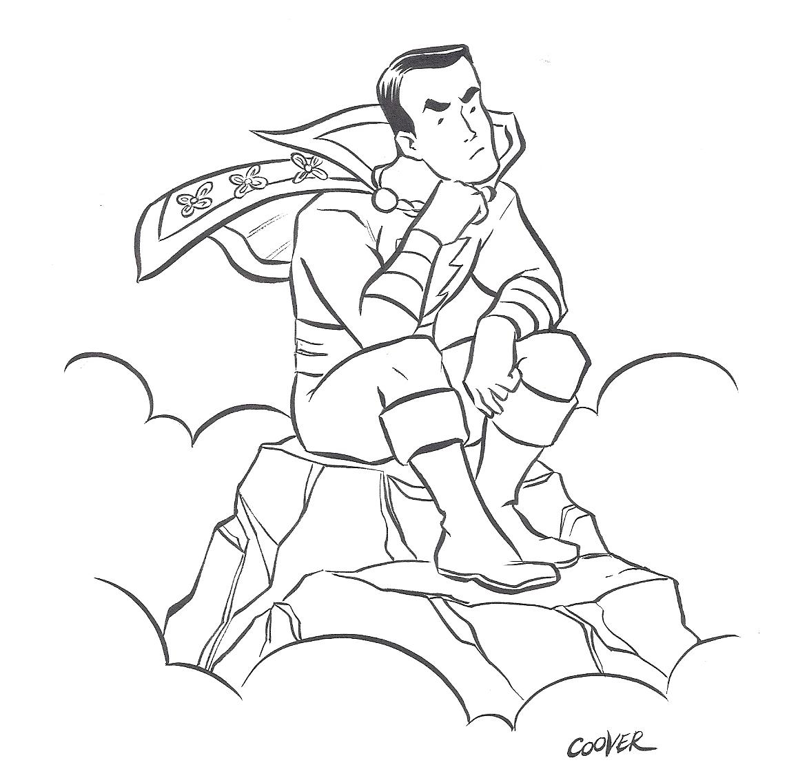
Garrett Martin: Hey, this comic, let's talk about it! Aqua Leung would be nothing without the awesome art of Paul Maybury and colorist Russ Lowery. Honed through hard years of muralizing on (or I guess around) these mean streets of Boston, Maybury's art is pretty damn amazing, all fluid and vibrant and flat-out eye-catching in the most impressive of manners. It's surprisingly great work from a relative unknown, and surprises even more by not being quite what you expect. From the Wind Waker-ish look of the title character you'd think Aqua Leung would be another Western tribute to manga, a la Scott Pilgrim, but Maybury's work runs deeper than that. Yeah, there's an obvious anime influence, but also one from American cartoons, and the character designs and backgrounds make me think of European fantasy books and movies, like The Neverending Story and Tolkien. And Lowery's colors are pretty damn vital; despite the murky, underwater setting, these are some of the richest, brightest colors I've seen in a comic recently. So yeah, this here art? It's ridiculous. In it's goodness. Yeah.
Oh, wait, there's a story, too?
Hillary Brown: Yeah, I don't think there's any question that the art trumps the story, which isn't bad but is in many ways pretty standard Journey of the Hero stuff: go here, complete this task, lose this father figure, yadda yadda. It's almost not a comic at all, but a picture book in terms of the watery beauty of some of the pages. It's just that it's a little too dark for most kids, and there are allusions to the history of slavery in the United States and lots of people get killed, although it is, occasionally, hard to be sure that they've died or not. Basically, the art is lovely and carefully done, but it's not always at its best in conveying the story, and, considering the dearth of dialogue or narration, it should perhaps have been thought out more with regard to function as well as form. For example, as I just mentioned, it's not always easy to tell someone has died, and sometimes you find out a few pages later and have to flip back. It's a bit hard for me to tell if this is my own weakness in interpreting visuals or more of a storytelling problem. Did you find it confusing? Or were you actually devoting your complete attention to it as opposed to reading it while syndicated TV played in the background and your spouse asked you questions and you had to get up and add fabric softener to the wash?
The other thing I really want to know, and I haven't done any research on the matter yet, is whether there's more of this coming or not. It seems to have been published in this one burst (at least according to the colophon, which usually says), but it ends so abruptly. You can't even see it winding down because there are 20 pages of covers and pin-ups reproduced in the back of the book, so you think you've got a ways to go and then, boom, it's done, before the real fight even begins. Are they just setting us up for a sequel?
GM: I didn't really find the art to be confusing. If I'm thinking of the same character you're referring to, they do wait a few pages to confirm that death, but it's clear from the initial scene that the dude's been fucked up something fierce. I think it had to be all that stupid crap distracting you, like husbands, and shit. (Seriously, that guy? Fuck him.*)
But yeah, this story is completely nondescript. We've seen all this in countless movies, books, cartoons, comics, video games, toy commercials, etc. I used to have a few commemorative fast food glasses with more narrative depth. There are a couple of legitimately funny scenes, and those are the only moments where Mark Andrew Smith's writing really stands out. It's not bad, or embarrassing, but dull, thoroughly and resolutely. Maybury's art is great enough to make the overall reading experience enjoyable, but Aqua Leung could've been so much more. And it's seriously isapointing that Maybury's excellently designed characters are saddled with such uninspired backstories and personalities.
I have no idea if this is officially the start of a series, but I'm sure everybody involved is hoping it becomes one. And if not a series of books, then maybe a cartoon or three. That conclusion is far too abrupt and open-ended for them to not have future plans.
Lemme summarize Aqua Leung like this: it's really similar to a comic called Rocketo that came out a couple years ago. Both are aquatic-based fantasy/adventure comics that prioritize art over story. You can excuse Rocketo more, though, 'cuz Frank Espinosa is a ridiculously great artist and visual storyteller. He had a co-writer on Rocketo, but the script was pretty clearly secondary to the art all along. Aqua Leung suffers in comparison because, as good as his art is, Maybury can't match Espinosa in the storytelling department, and Smith's unexceptional script doesn't help any.
*: I mean, no, for real.
HB: Maybe it's just that I felt far too many pages were devoted to fight scenes, which I like more in movies and TV than in comics. I don't want to have to use my imagination! Keep the camera still and make me do no work but to gasp with wonder and delight. And also, I'm a fan of talkiness. That doesn't mean I don't love Buster Keaton or 2001: A Space Odyssey, but generally I'm going to pick something with some words.
I do really like the scenes that establish Aqua in our world, clearly reading or having read Aquaman and the like, getting pushed around and shoved into the pool. He may grow up too quickly in the course of the book, but then, the lack of narration means you have little idea how long all of this takes or how old he is to begin with. That's the kind of thing I get frustrated with--although I can be distracted from it by wonderfulness.
I don't exactly mean to suggest that the story is boring or too slow or whatever. It's just a lot like much anime I've flipped by on Cartoon Network (e.g., Dragonball Z), in which it's mostly very drawn out fighting that can take up an entire episode (or several) and a bit of mythology in the background. Maybe the target audience here is 13-year-old boys, who seem to have endless patience for fight scenes. It does seem, from the googling I have now done, that they're planning on doing a series of several books, but I don't know if I'll buy another one. The comparison I'm going to make, to a comic book you haven't read, is to the first volume of Dungeon, which is also Joseph Campbell stuff but without taking any of it seriously at all. I like some of that questing hoo-ha, but it can get a little heavy at times, so you need someone like Trondheim to puncture it. I read both Aqua Leung and Dungeon on the same day, and I only ended up raving about one of the two.
A couple more things: 1) My copy of Aqua Leung arrived a little bit ripply, as though it had experienced moisture damage. I don't think this is a clever promotional device, but not waiting for the pages to dry before binding. Still, it was appropriate. 2) The design of all the stuff at the back of the book with the credits is weirdly amateurish, no? The margins are odd, the font isn't good, and it just kind of looks as though it was laid out by someone without great computer skills. Is this intentional? Is it the indieness showing through the slick exterior? It just kind of bugs me.
GM: My copy came autographed by Maybury, at no extra charge.
I used to be a 13-year-old boy, so maybe that's why I didn't think twice about all the fighting. Those scenes didn't seem gratuitous or overly long to me, and they all serve the story, even if in completely expected ways. "Oh, the fish-out-of-water kid learns how to fight! Now he and a small ragtag group of warriors bond on an expedition! And here's the big showcase finale, where the youthful lead saves the day and becomes a man!", etc.
Man, I sound like an asshole. The story is not in any way bad, in fact it's utterly competent, totally serviceable, and perfectly acceptable. It's just so damn unoriginal, dispiritingly so, and thus far too easy to mock. You're right when you say it isn't slow; it's jam-packed with action. The story is boring, though, because there's nothing unique about it. It's uninspired. It'd be great for kids, though, true. Like you said, even the back-matter feels perfunctory. But, y'know, comics are a visual medium, and even though I generally follow writers more than artists, I feel weird not recommending a book with such beautiful artwork.
HB: I agree. I just want people to know what they're getting into.
3 comments:
I just finished Aqua Leung, and I agree that the book was neither slow nor particularly inspiring/original/unique. The art is pretty great, but, like Hillary, I did sometimes find the fighting bits confusing and/or boring--basically, I may have been able to tell more what was going on in some panels after looking at them for a long time, but that kind of pisses me off in comics. I want to know what is happening pretty much immediately. By the way, did you guys notice Jeffrey Brown did one of the pinups in the back?
Thank you! Even if I am an impatient jackass, I'm not the only impatient jackass in the world. I'll spend the time with Chris Ware's stuff, but not with everyone's.
I didn't notice, but I was, as established, distracted.
jared stop distracting her. she's trying to write a blog.
Post a Comment